
Filled Contour Plots on Map Projections
QUESTION: I'm creating a filled contour plot on a map projection. The contours are correct, but the filled contour colors are completely wrong. What is going on?
![]()
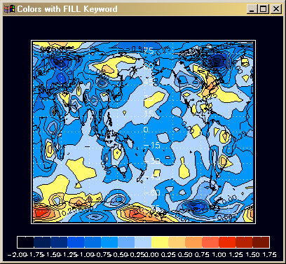
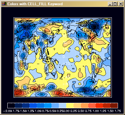
ANSWER: Most of the time filled color contour plots are created by setting the FILL keyword on the Contour command. But using this keyword when overplotting a filled contour plot on a map projection results in incorrect colors on the map. The proper keyword to use is the CELL_FILL keyword. Here is some example code that produced the correctly-colored figure below. The incorrectly-colored figure was created with the same code, but with the FILL keyword set instead.
   Map_Set,  0, 180, /Cylindrical, LIMIT=limit, $
        Position=[0.1,0.15,0.9,0.9], $
        Color=white, charsize=2

   Contour, data, lons, lats, $
        C_Colors=cn, Color=black, $
        Max_Value=cmax, Min_Value=cmin, $
        Levels=clevels, /CELL_FILL, /Overplot

   Contour, data, lons, lats, Color=black, $
        Max_Value=cmax, Min_Value=cmin, $
        Levels=clevels, C_Labels=Replicate(1,15), /Overplot

   Map_Continents, /COASTS, Color=black, MLineThick=1, MLineStyle=0

   Map_Grid, /GRID, LonDel=45, LatDel=15, $
        LatAlign=0.0, LonAlign=0.5, LonLab=-89.0, $
        Color=white, Linestyle=1, /LABEL

   FSC_Colorbar, NColors=cnum, Divisions=cnum, $
          Position=[0.05, 0.05, 0.95, 0.1], Range=[cmin,cmax], $
          Charsize=0.8, Format='(F5.2)'
Here is an example of a filled contour plot placed on a map projection with the FILL keyword used. The light blue area, with data between 0.0 and 0.25, should actually be colored yellow.
Here is the correct coloration. The figure is created by setting the CELL_FILL keyword, as described above.
![]()
Last Updated 8 January 2006