| How do you color contour levels/ranges in a PLOT which uses the functions CONTOUR and SURFACE? [message #13034] |
Mon, 05 October 1998 00:00  |
 Robert Lematta
Messages: 3
Registered: September 1998
|
Junior Member |
|
|
To: The idl gods,
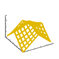
I am trying to fill in different contour levels of a 3D plot. I have 10
levels of contours, which are defined by using the following commands.
surfr
vals=[-200,-190, -180, -170,-160,-150,-140,-130,-120,-110,-100]
contour, Array1, /follow, levels=vals, /T3D, /overplot
surface, Array1, /noerase
Array1 is the 2 D array of data with values running between -200 and
-100. What I would like to
display is a 3D plot with the colors for each level (ex -200 to -190,
-190 to -180, etc) as a distinct color
filled in. the data is kind of like a topographical map with peaks and
valleys. What I am trying to do is
to shade a given "altitude range" with the same color.
Can anyone out there help me?
Regards,
robert
lematta@yahoo.com
|
|
|
|
| Re: How do you color contour levels/ranges in a PLOT which uses the functions CONTOUR and SURFACE? [message #13132 is a reply to message #13034] |
Tue, 20 October 1998 00:00  |
 Amit Ghosh
Messages: 7
Registered: July 1998
|
Junior Member |
|
|
> I am trying to fill in different contour levels of a 3D plot. I have 10
> levels of contours, which are defined by using the following commands.
>
> surfr
> vals=[-200,-190, -180, -170,-160,-150,-140,-130,-120,-110,-100]
> contour, Array1, /follow, levels=vals, /T3D, /overplot
> surface, Array1, /noerase
>
> Array1 is the 2 D array of data with values running between -200 and
> -100. What I would like to
> display is a 3D plot with the colors for each level (ex -200 to -190,
> -190 to -180, etc) as a distinct color
> filled in. the data is kind of like a topographical map with peaks and
> valleys. What I am trying to do is
> to shade a given "altitude range" with the same color.
Robert, I think I know what you are trying to do: You want a shaded contour
plot, so that a circular peak would appear as a `bulls-eye', with sharp
transitions between levels. One way to get this effect is create a `quantized'
dataset. So for instance you set all the values between -200 and -191 to one
value (say -200), then you set all the values from -190 to -181 to another
value (say -190) etc. You can then plot the image of that dataset with an
appropriate colormap (using bytscl etc). You can even choose arbitrary colors
for the levels by setting the `value' for each level to be the byte value for
the color you desire.
-----------== Posted via Deja News, The Discussion Network ==----------
http://www.dejanews.com/ Search, Read, Discuss, or Start Your Own
|
|
|
|
 comp.lang.idl-pvwave archive


 Members
 Search
 Help
Help Login
Login Home
Home


