
Producing a Sine Plot
QUESTION: Here is the code I use to produce a sine plot in IDL.
    min = 0
    max = 100
    n = 100
    x = FltArr(n+1)
    FOR j=0,n DO x[j] = Min + Double(j) * (max-min) / n
    y = Sin(2 * !PI * x)
    Plot, x, y
But, until the variable n gets to be about 300 or so, the plot looks really bad. You can see an example in the figure below, in which the top figure is done with n=100 and the bottom figure is done with n=300. Why does the first figure look so lousy?
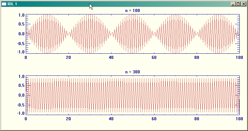 |
| The sine plot depends on the number n in a strange way. Why? |
![]()
ANSWER: The answer was provided in one word by Bob Stockwell: aliasing. Aliasing is an effect well known in signal processing when continuous signals are sampled. In this case, you are undersampling the signal, which is adding distortion to it. Basically, you have to have enough samples in one complete wave to adequately describe the wave, which happens in your case when n gets to be about 300.
You can see what is happening if you plot the original data on top of data that is sampled at 10 times the frequency of the original n=100 data. Have a look at the figure below.
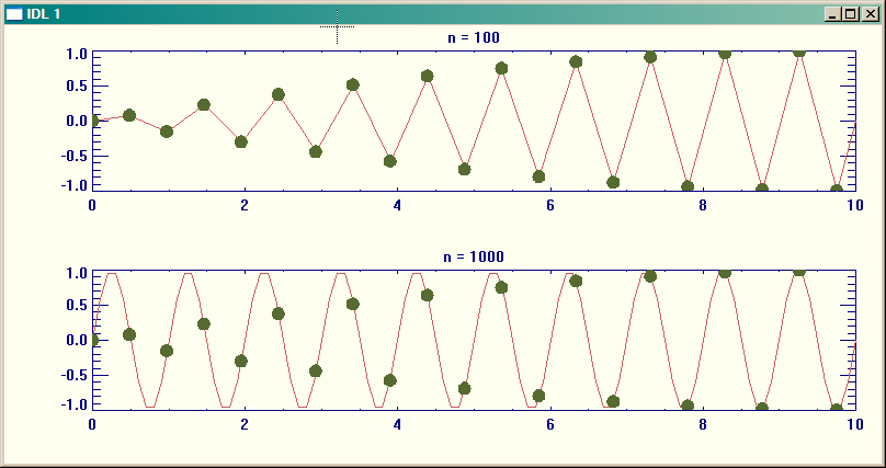 |
| This is an example of what happens when a single is undersampled. |
![]()
Version of IDL used to prepare this article: IDL 7.0.1.
![]()
Copyright © 2008 David W. Fanning
Last Updated 2 May 2008