Creating a 2D Scatter Plot
QUESTION: Can you show me how to create a 2D scatter plot in IDL? I would like to know the Pearson correlation coefficient and I would like to fit a straight line through the data. It would be perfect if I could determine the equation of that straight line, too.
![]()
ANSWER: A 2D or two-dimensional scatter plot is easily created with the Coyote Graphics routine, cgScatter2D. You can see an example this and other scatter plots in the Coyote Plot Gallery. The program plots the data values as symbols, and overlays a best-fit straight line through the data. The Pearson correlation coefficient and the equation of the line are written on the plot by default. These values can also be recovered programmatically by using the output keywords Coefficient and Params, respectively.
Here is a simple example. First, let's create two data sets to compare. Let's pretend the first data set is the number of minutes students studied for a particular quiz, and the second data set in the score they received on the quiz.
  data_1 = cgDemoData(1)+ RandomU(seed, 101) * 10
  data_2 = cgDemoData(1)+ RandomU(seed, 101) * 20 + 50
In the simplest case, we just plot one data set against the other.
  cgWindow, WXSize=500, WYSize=350
  cgScatter2D, data_1, data_2, XTitle='Study Time (minutes)', YTitle='Quiz Grade', /Window
  cgControl, Create_PNG='figure_1.png'
You see the results in the figure below.
 |
| A basic scatter plot. |
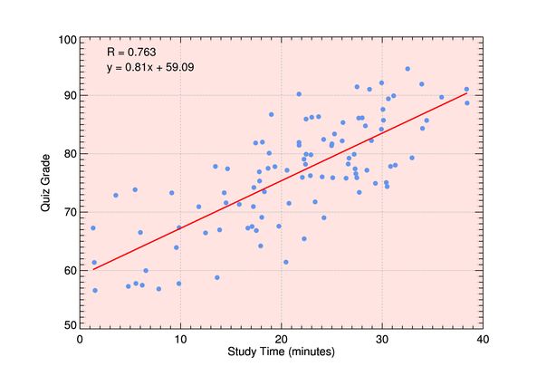
There are many keywords to this routine, so you can make the result as elaborate as you like. Here is a fancier scatter plot with a grid on the plot, and the area inside the axes filled with a color.
  cgScatter2D, data_1, data_2, XTitle='Study Time (minutes)', YTitle='Quiz Grade', $
    /Grid, FillColor='rose', Color='CornFlower Blue', PSym=16, FThick=2, $
    XRange=[0,40], /Window
  cgControl, Create_PNG='figure_2.png'
You see the results in the figure below.
 |
| A more elaborate scatter plot. |
![]()
Version of IDL used to prepare this article: IDL 7.1.
![]()
![]()


