
Drawing a Box and Whisker Plot
QUESTION: Can you show me how to draw a box and whisker plot in IDL. The box on the plot should be drawn around the 25th and 75 quartile of the data, and the whiskers should extend out to largest and smallest value within 1.5 times the interquartile range (IGR). Outliers should be marked with circles.
![]()
ANSWER: The idea behind a box and whisker plot is that the data should first be divided into two equal groups by finding the median value of the data. Then, each of these two sub-groups should be divided in the same way. If done properly, this should divide the data into four equally populated sub-groups. The divisions between groups are called the 25th quartile, the median value, and the 75th quartile.
In the cgBoxplot program I wrote to do this, I sort the data and find the quartiles and the IRG like this.
   sortedData = data[Sort(data)]
   IF N_Elements(sortedData) MOD 2 EQ 0 THEN BEGIN
      index = N_Elements(sortedData)/2
      medianData = (sortedData[index-1] + sortedData[index]) / 2.0
      lowerGroup = sortedData[0:index-1]
      higherGroup = sortedData[index:N_Elements(data)-1]
   ENDIF ELSE BEGIN
      index = N_Elements(sortedData)/2
      medianData = sortedData[index]
      lowerGroup = sortedData[0:index-1]
      higherGroup = sortedData[index+1:N_Elements(data)-1]
   ENDELSE
   quartile_25 = Median(lowerGroup, /EVEN)
   quartile_75 = Median(higherGroup, /EVEN)
   irq = quartile_75 - quartile_25
The next step is easy. All we have to do is use IDL's graphics commands to draw lines and symbols on a plot. Given that we have a width of the box and a location where we should draw the box along the X axis (in the variables width and xlocation, resprectively), we can draw the box plot like this. Note how I use Value_Locate to identify those data that are inside the part of the plot represented by the whiskers.
   minData = MIN(data, MAX=maxData)
   halfwidth = width / 2.0
   x1 = xlocation - halfwidth
   x2 = xlocation + halfwidth
   y1 = quartile_25
   y2 = quartile_75
   cgPlotS, [x1,x1,x2,x2,x1], [y1,y2,y2,y1,y1], COLOR=color
   cgPlotS, [x1, x2], [medianData, medianData], COLOR=color

   ; Are there any data greater than 1.5*irq
   imax = Where(data GT quartile_75 + (1.5 * irq), maxcount)
   IF maxcount EQ 0 THEN BEGIN
     top = maxData
   ENDIF ELSE BEGIN
         index = Value_Locate(sortedData, quartile_75 + (1.5 * irq))
         top = sortedData[0 > (index) < (N_Elements(data)-1)]
   ENDELSE

   ; Are there any data less than 1.5*irq
   imin = Where(data LT quartile_25 - (1.5 * irq), mincount)
   IF mincount EQ 0 THEN BEGIN
         bottom = minData
   ENDIF ELSE BEGIN
         index = Value_Locate(sortedData, quartile_25 - (1.5 * irq))
         bottom = sortedData[0 > (index+1) < (N_Elements(data)-1)]
   ENDELSE

   ; Draw the whiskers.
   cgPlotS, [xlocation, xlocation], [quartile_75, top], COLOR=color
   cgPlotS, [xlocation, xlocation], [quartile_25, bottom], COLOR=color
   cgPlotS, [xlocation - (halfwidth*0.5), xlocation + (halfwidth*0.5)], $
          [top, top], COLOR=color
   cgPlotS, [xlocation - (halfwidth*0.5), xlocation + (halfwidth*0.5)], $
          [bottom, bottom], COLOR=color

   ; Draw outliners if there are any.
   IF maxcount GT 0 THEN BEGIN
      FOR j=0,maxcount-1 DO cgPlotS, xlocation, data[imax[j]], $
         PSYM=cgSymCat(9), COLOR=color
   ENDIF
   IF mincount GT 0 THEN BEGIN
      FOR j=0,mincount-1 DO cgPlotS, xlocation, data[imin[j]], $
         PSYM=cgSymCat(9), COLOR=color
   ENDIF
As an example, you can download data from the Michaelson-Morely experiment in which they measured the speed of light. The data is in a file named mm_data.dat. You can use this code to open and read the data in the file, and display it as a box plot.
   OpenR, 1, 'mm_data.dat'
   header = Strarr(2)
   Readf, 1, header
   data = Intarr(5, 20)
   Readf, 1, data
   Close, 1
   cgBoxPlot, data, XTITLE='Experiment Number', $
      YTITLE='Speed of Light (km/s minus 299,000)', /Window
   cgPlotS, !X.CRange, [792.458,792.458], Color='red', /AddCmd
   cgText, 3, 775, /Data, Color='red', 'True Speed', Alignment=0.5, /AddCmd
You can see the results in the figure below.
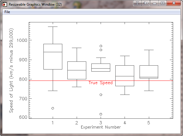 |
| A box and whisker plot in IDL using data from the Michaelson-Morley experiment. |
A different version of this plot can be found in the Coyote Plot Gallery.
![]()
Copyright © 2007-2009 David W. Fanning
Updated 26 August 2007
Last Updated 4 March 2009


