Creating a Bar Plot
QUESTION: I've been trying to use the Bar_Plot routine in IDL, but it seems even older than most of the IDL routines. Do you have something similar for producing bar plots in the Coyote Graphics library?
![]()
ANSWER: Yes, indeed. You can use the cgBarPlot program from the Coyote Library to produce a bar plot in IDL. Keywords to the program allow you to produce various kinds of bar plots. To illustrate, let's create some data to display.
   seed = -5L
   data1 = RandomU(seed, 5) * 10.0
   data2 = RandomU(seed, 5) * 7.5
   data3 = RandomU(seed, 5) * 7.5
   data4 = RandomU(seed, 5) * 10.0
Simple individual bar plots can be created either using the colors in the current color table, or by specifying the bar colors yourself.
   cgDisplay, 750, 375, WID=3
   !P.Multi = [0,2,1]
   labels = ['Exp 1', 'Exp 2', 'Exp 3', 'Exp 4', 'Exp 5']
   cgLoadct, 33, Clip=[10,245]
   cgBarPlot, data1, BarNames=labels
   colors = ['cornflower blue','sea green','orange red','goldenrod','dark orchid']
   cgBarPlot, data2, BarNames=labels, Colors=colors
   !P.Multi = 0
You see the result in the figure below.
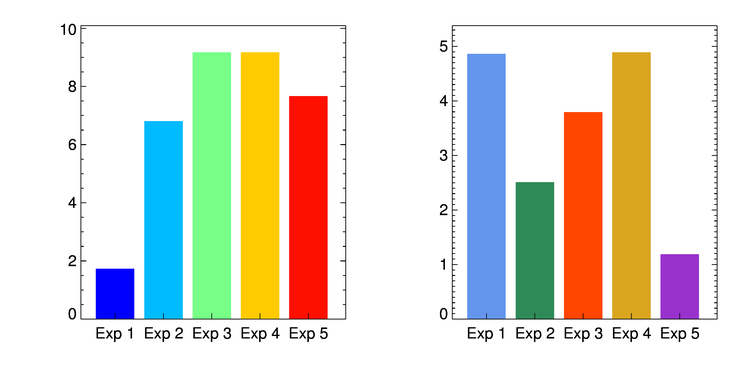 |
| Bar colors can be chosen directly or by loading a color table. |
More complicated bar plots can be produced, too. The first plot we create is just a plot with all four data sets displayed.
   cgDisplay, 650, 450, WID=0
   !P.Multi = [0,2,2]
   cgBarPlot, data1, YRange=[0,12], Colors='red', XTitle='Class 1'
   cgBarPlot, data2, YRange=[0,12], Colors='blue', XTitle='Class 2'
   cgBarPlot, data3, YRange=[0,12], Colors='gold', XTitle='Class 3'
   cgBarPlot, data4, YRange=[0,12], Colors='dark green', XTitle='Class 4'
   !P.Multi = 0
You see the result in the figure below.
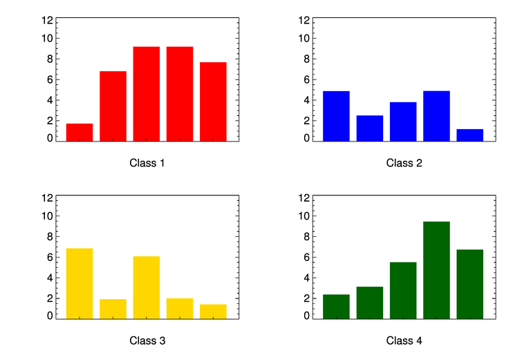 |
| The four data sets displayed as individual bar plots. |
Next, we make a stacked bar plot, in which the four data sets are stacked on top of each other. The legend is placed on the plot using the NASA Astronomy Library routine, AL_Legend.
   cgDisplay, 650, 450, WID=1
   labels = ['Exp 1', 'Exp 2', 'Exp 3', 'Exp 4', 'Exp 5']
   cgBarPlot, data1, YRange=[0,35], Colors='red', BarNames=labels
   cgBarPlot, data2, Colors='blue', /Overplot, BaseLines=data1
   cgBarPlot, data3, Colors='gold', /Overplot, BaseLines=data1+data2
   cgBarPlot, data4, Colors='dark green', /Overplot, BaseLines=data1+data2+data3
   items = ['Class 1', 'Class 2', 'Class 3', 'Class 4']
   colors = ['red', 'blue', 'gold', 'dark green']
   AL_Legend, items, Colors=colors, PSym=Replicate(15,4), SymSize=Replicate(1.75,4), $
       Charsize=cgDefCharsize(), Position=[0.20, 0.92], /Normal
You see the results in the figure below.
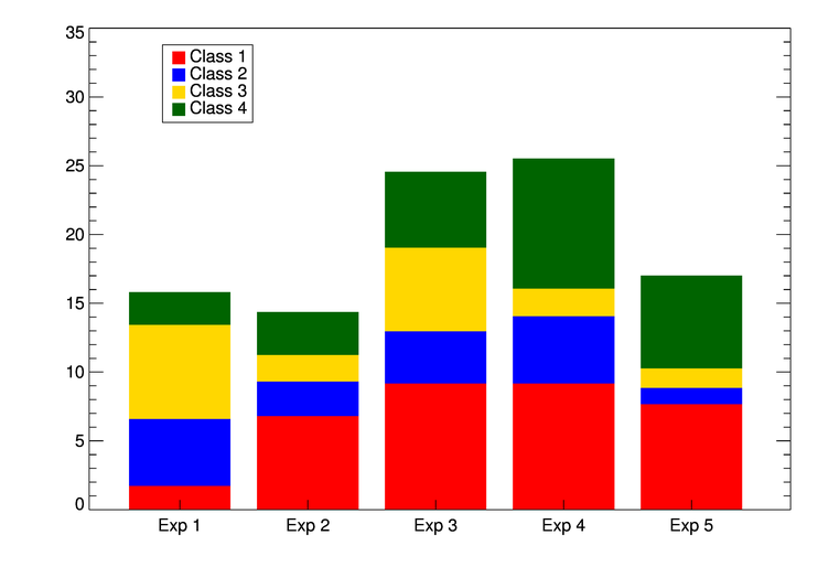 |
| The four data sets displayed as a stacked bar plot. |
We can also see the four data sets displayed side by side in a bar plot.
   cgDisplay, 650, 450, WID=2
   cgBarPlot, data1, YRange=[0,12], Colors='red', BaseRange=0.2, BarOffset=2.5
   cgBarPlot, data2, Colors='blue', /Overplot, BaseRange=0.2, BarOffset=9.5
   cgBarPlot, data3, Colors='gold', /Overplot, BaseRange=0.2, BarOffset=17.0
   cgBarPlot, data4, Colors='dark green', /Overplot, BaseRange=0.2, BarOffset=24.5
   items = ['Class 1', 'Class 2', 'Class 3', 'Class 4']
   colors = ['red', 'blue', 'gold', 'dark green']
   AL_Legend, items, Colors=colors, PSym=Replicate(15,4), SymSize=Replicate(1.75,4), $
       Charsize=cgDefCharsize(), Position=[0.45, 0.92], /Normal
You see the results in the figure below.
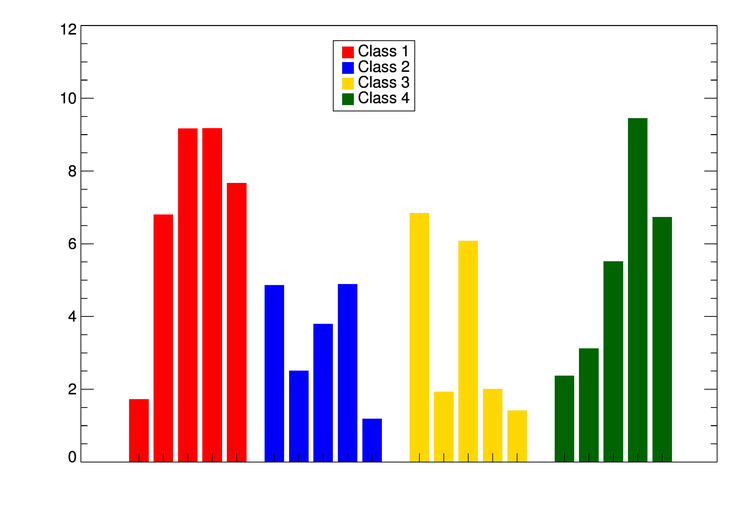 |
| The four data sets displayed side-by-side. |
Finally, we can see each "experiment" displayed side-by-side in the bar plot.
   cgDisplay, WID=3
   barnames = ['Exp 1', 'Exp 2', 'Exp 3', 'Exp 4', 'Exp 5']
   cgBarPlot, data1, YRange=[0, 12], BarOffset=1.25, BarSpace= 0.8, BarWidth=0.175, Colors='red'
   cgBarplot, data2, /Overplot, BarOffset=2.25, BarSpace= 0.8, BarWidth=0.175, Colors='blue', BARNAMES=barnames
   cgBarplot, data3, /Overplot, BarOffset=3.25, BarSpace= 0.8, BarWidth=0.175, Colors='gold'
   cgBarplot, data4, /Overplot, BarOffset=4.25, BarSpace= 0.8, BarWidth=0.175, Colors='dark green'
   colors = ['red', 'blue', 'gold', 'dark green']
   items = ['Class 1', 'Class 2', 'Class 3', 'Class 4']
   Al_Legend, items, /Fill, PSym=Replicate(15,4), Colors=colors, SymSize=Replicate(1.75,4), $
      Position=[0.20, 0.92], /Normal, Charsize=cgDefCharSize()
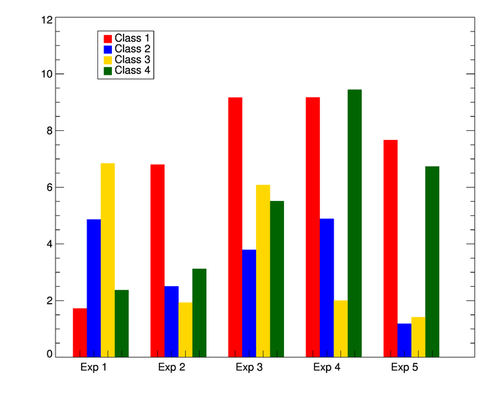 |
| The four data sets displayed side-by-side by experiment. |
It is easy to add error bars to the bar plot. To do so, you need to get the locations of the bars from the program itself. This is done with the BarCoords keyword, like this. You use the Coyote Graphics routine cgPlot to add the error bars.
   data = RandomU(-45L, 5) * 10.0
   labels = ['Exp 1', 'Exp 2', 'Exp 3', 'Exp 4', 'Exp 5']
   cgLoadct, 33, Clip=[10,245]
   colors = ['cornflower blue','sea green','orange red','goldenrod','dark orchid']
   cgBarPlot, data, BarNames=labels, Colors=colors, BarCoords=xlocs
   lowErrs = RandomU(seed, 5)*0.75
   highErrs = RandomU(seed, 5)*0.5
   cgPlot, xlocs, data, Err_YLow=lowErrs, Err_YHigh=highErrs, /NoData, /Overplot, $
       Err_Color='charcoal', Err_Thick=2
You see the results in the figure below.
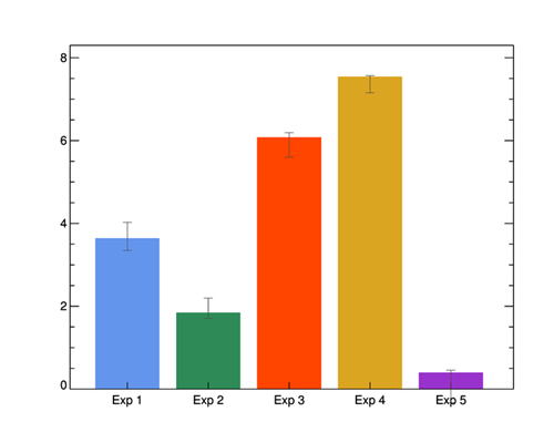 |
| A bar plot with error bars added with cgPlot. |
Because BarCoords is an output keyword, and you can't return output keywords in general from cgWindow, if you want to display a bar plot with error bars in a resizeable graphics window, you have to get the location information first. The code would look like this.
   data = RandomU(seed, 5) * 10.0
   labels = ['Exp 1', 'Exp 2', 'Exp 3', 'Exp 4', 'Exp 5']
   cgLoadct, 33, Clip=[10,245]
   colors = ['cornflower blue','sea green','orange red','goldenrod','dark orchid']
   cgDisplay, /Pixmap
   cgBarPlot, data, BarNames=labels, Colors=colors, BarCoords=xlocs
   wDelete, !D.Window
   lowErrs = RandomU(seed, 5)*1.5
   highErrs = RandomU(seed, 5)*1.5
   cgBarPlot, data, BarNames=labels, Colors=colors, /Window
   cgPlot, xlocs, data, Err_YLow=lowErrs, Err_YHigh=highErrs, /NoData, /Overplot, $
       Err_Color='charcoal', Err_Thick=2, /AddCmd
![]()
Version of IDL used to prepare this article: IDL 8.1.
![]()
![]()
Updated: 16 December 2013


